Introduction
Welcome to MoMo’s brand identity for partners page. We take pride in the quality of our work. If you have the permission to utilize our assets, please follow these guidelines to keep them looking their best.
Using Our Logo
In addition to the logo usage policy, please read the Best Practices when there is a need to show the MoMo Payment method on your website/app.
The Primary Logo
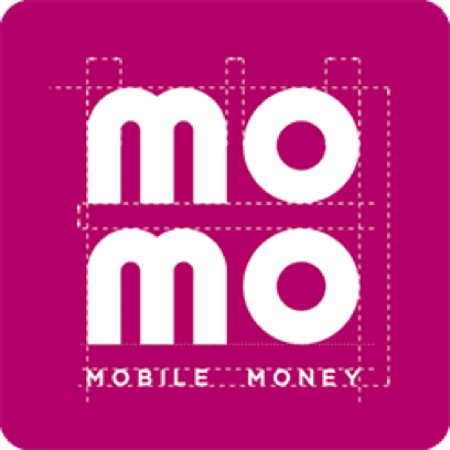
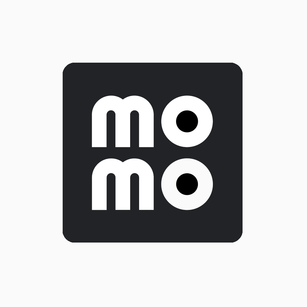
The MoMo logo with wordmark
MoMo’s official logo is the combination of icon, wordmark and background (rounded square or circle). Please note that the icon and wordmark in the logo are white, not transparent even in a dark background.
These verified logos are often used on the homepage for branding purposes: showing MoMo as a partner with your company, marketing campaigns, promotions,…
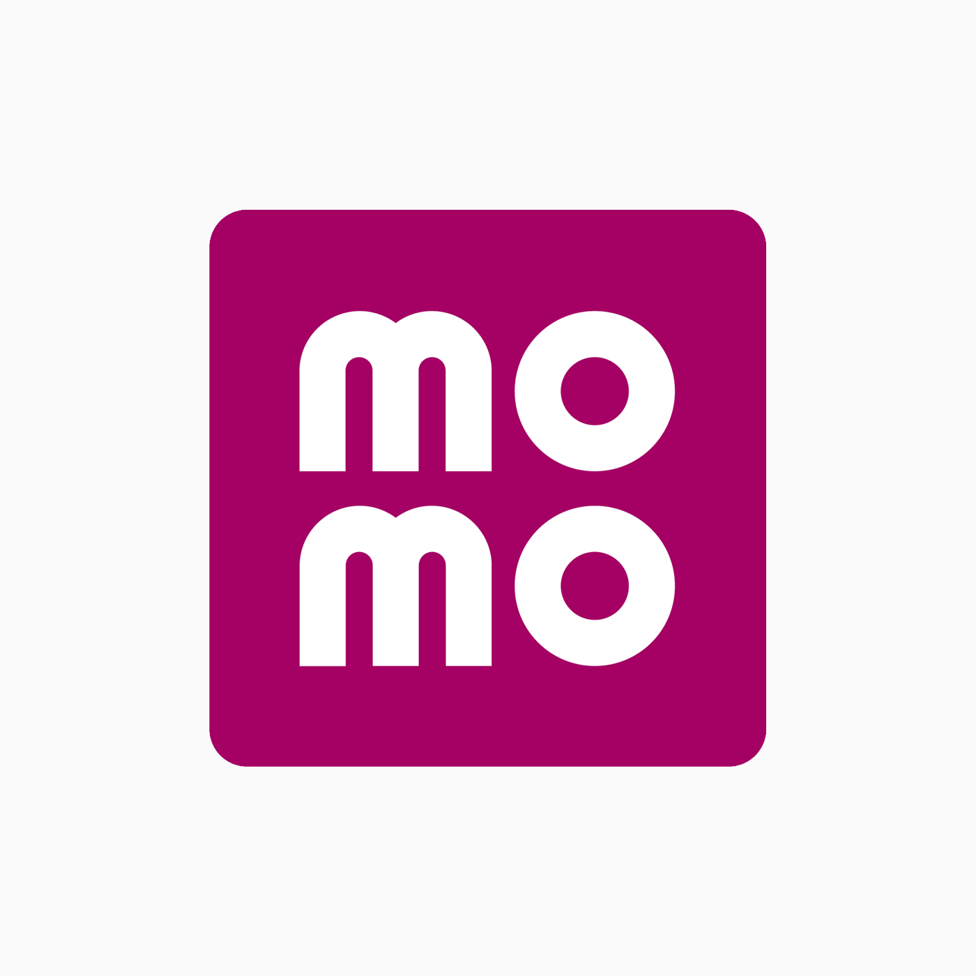
| Square Logo Square logos are commonly used on iOS devices |
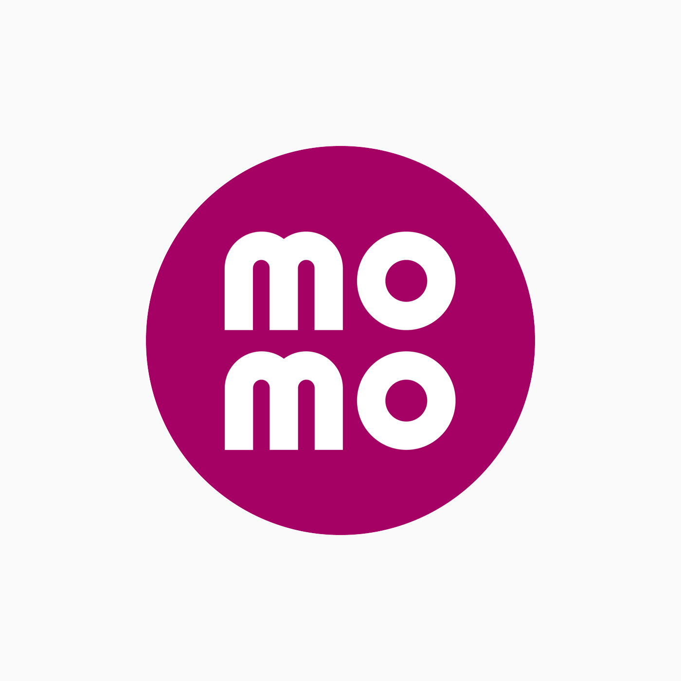
Circle Logo Circle logos are commonly used on Android devices |
The MoMo logo without wordmark (recommended)
Nevertheless, the MoMo logo is officially used in a checkbox or button on your website or application, which directly relates to the payment solutions powered by MoMo. In these cases, the size of the logo is too small, the wordmark cannot be read, so we encourage you to use the MoMo logo without wordmark instead. It can represent the brand on its own without the need for an official logo.
MoMo logo without wordmark is often encouraged for your checkout/payment setting page. In all cases of using another type of logo or replacing it with an icon, permission is required from MoMo.
 |
 |
|---|---|
| Square logo without wordmark | Circle logo without wordmark |
Download Primary Logo
Logo Variants
The secondary logo
In case our logo with a pink background is not an appropriate option, please use a white background logo (secondary logo) for maximum contrast. This logo is often used in a dark background or when there are many details or patterns in the background.
| Secondary logo | Secondary logo without wordmark |
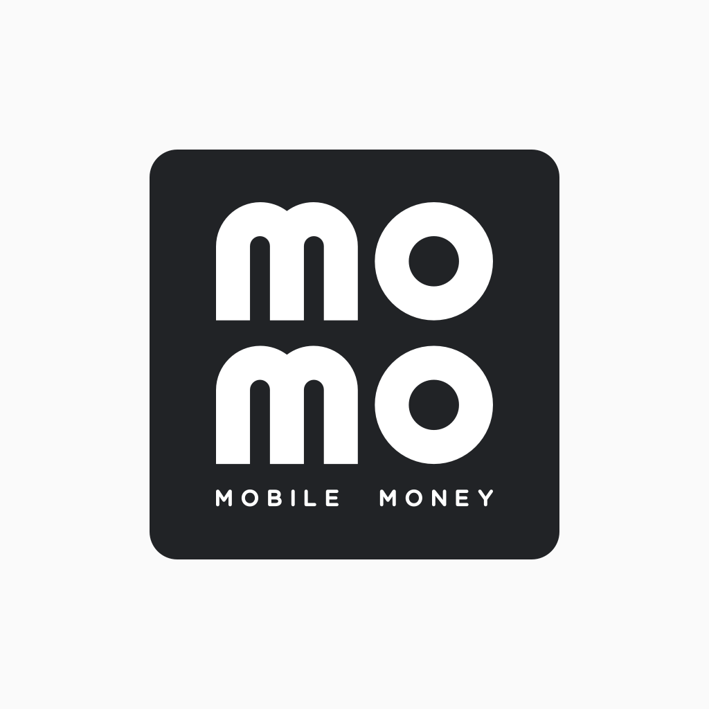
The monotone logo
The monotone logo is used with the meaning that this payment method is temporarily disabled (user has not binded MoMo yet, or user has not used MoMo to make a payment on your checkout page before). However, you should have MoMo’s approval when using this.
Note that regarding the monotone logo, the icon and wordmark are still white.
 |
 |
|---|---|
| Monotone logo | Monotone logo without wordmark |
Download Variant Logo
MoMo Icon
In some cases, MoMo icon can represent the brand on its own without the need for a logo.
- When the size of the logo is too small, the wordmark cannot be read.
- In a situation where the brand identity is fully represented.
- When space is limited (logo is in a circle, square,…).
- Usually used when putting on posters for marketing purposes (not recommended to represent payment methods on the checkout page/payment settings page).
Vertical icon
![]()
Horizontal icon
![]()
- The accepted icon color is pink and black-white
- When choosing colors, pay attention to the background to choose a color with the proper contrast.
- Make sure there is enough free space around the icon.
Download Icon Logo
Free Space
Our logos and icons will work best when there is enough space to display:
| Square Logo Always keep an “X” space around MoMo’s logo to ensure the best display. 2X = height of the logo |
Circle Logo Always keep an “X” space around MoMo’s logo to ensure the best display. 2X = height of the logo |
| Vertical icon Always keep “2X” space around MoMo’s logo to ensure the best display face. X = thickness of the “o” in the icon |
Horizontal icon Always keep “2X” space around MoMo’s logo to ensure the best display face. X = thickness of the “o” in the icon |
Minimum Size
To maintains the image integrity, please ensure the logo and icon are not scaled to the following parameters:
| Square Logo The width of the logo should not be less than 40px (digital) or 10mm (print). |
Circle Logo The width of the logo should not be less than 44px (digital) or 12mm (print). |
| Vertical Icon The width of the vertical icon should not be less than 30px (digital) or 10mm (print). |
Horizontal Icon The width of the horizontal icon should not be less than 90px (digital) or 20mm (print). |
Logo Misuse
Here are some examples of things we should absolutely avoid when using the MoMo logo:
Legal Regulations
You are required to follow the above principles when using or displaying MoMo’s products (logo, icon, trademark). Your utilization of our trademarks indicates your acceptance of the above guidelines and any violations of these principles may result in automatic termination of your license or privilege to use these trademark assets.